WDX-180
Web Development X
Test your skills: Sizing
(Updated: 10/10/2023)
The aim of this skill test is to assess whether you understand the different ways of sizing items in CSS.
Note:If you get stuck, then ask us for help!
Task 1
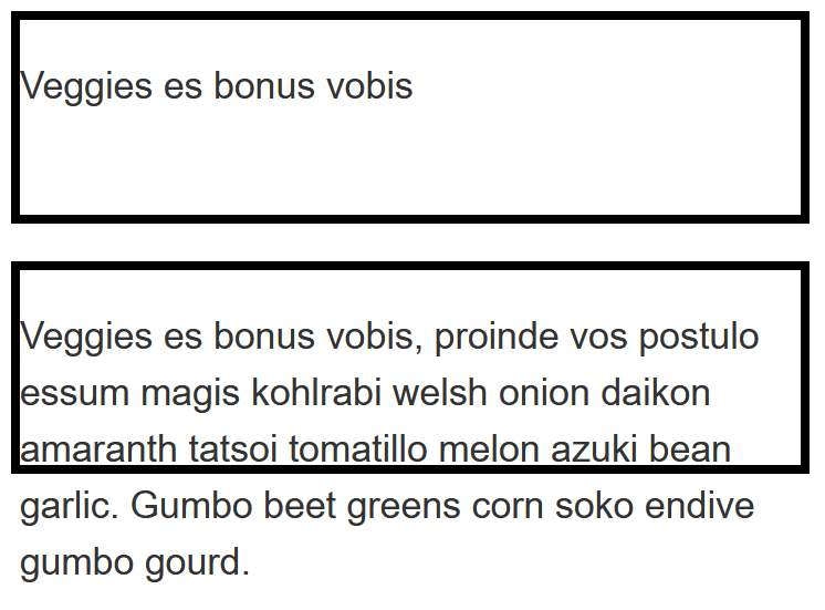
In this task, you have two boxes. The first should be sized so that the height will be at least 100 pixels tall, even if there is less content that would cause it to grow to that height. However, the content should not overflow if there is more content than fits in 100 pixels. Test this box by removing the content from the HTML to make sure you still get a 100 pixel tall box even with no content.
The second box should be fixed at 100 pixels tall, so that content will overflow if there is too much.
Copy and paste the code below in a file named height-min-height.html.
<!DOCTYPE html>
<html lang="en">
  <head>
    <meta charset="utf-8" />
    <title>Sizing Task 1: height and min-height</title>

    <style>
      body {
        background-color: #fff;
        color: #333;
        font: 1.2em / 1.5 Helvetica Neue, Helvetica, Arial, sans-serif;
        padding: 1em;
        margin: 0;
      }

      .box {
        border: 5px solid #000;
        width: 400px;
        margin-bottom: 1em;
      }

      .box1 {
      }

      .box2 {
      }
    </style>
  </head>

  <body>
    <div class="box box1">
      <p>
        Veggies es bonus vobis, proinde vos postulo essum magis kohlrabi welsh
        onion daikon amaranth tatsoi tomatillo melon azuki bean garlic. Gumbo
        beet greens corn soko endive gumbo gourd.
      </p>
    </div>

    <div class="box box2">
      <p>
        Veggies es bonus vobis, proinde vos postulo essum magis kohlrabi welsh
        onion daikon amaranth tatsoi tomatillo melon azuki bean garlic. Gumbo
        beet greens corn soko endive gumbo gourd.
      </p>
    </div>
  </body>
</html>
When you’re ready, move the files in the following path user/week03/exercises/day05/sizing_tasks/task01/ and run the git commands below to submit your exercise:
git add user/week03/exercises/day05/sizing_tasks/task01/git commit -m "sizing_tasks_task01"git push
Task 2
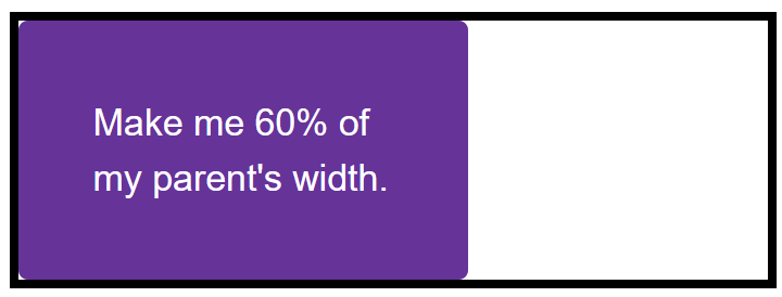
In this task, you have a box, which contains another box. Your task is to make the inner box 60% of the width of the outer box. The value of the box-sizing property is set to border-box, which means that the total width includes any padding and border. You should also give the inner box padding of 10% using the width (or inline size) as the size from which that percentage is calculated.
Copy and paste the code below in a file named percentages.html.
<!DOCTYPE html>
<html lang="en">
  <head>
    <meta charset="utf-8" />
    <title>Sizing Task 2: Percentages</title>

    <style>
      * {
        box-sizing: border-box;
      }

      body {
        background-color: #fff;
        color: #333;
        font: 1.2em / 1.5 Helvetica Neue, Helvetica, Arial, sans-serif;
        padding: 1em;
        margin: 0;
      }

      .box {
        border: 5px solid #000;
        width: 400px;
        margin-bottom: 1em;
      }

      .inner {
        background-color: rebeccapurple;
        color: white;
        border-radius: 5px;
      }
    </style>
  </head>

  <body>
    <div class="box">
      <div class="inner">Make me 60% of my parent's width.</div>
    </div>
  </body>
</html>
Your final result should look like the image below:
When you’re ready, move the files in the following path user/week03/exercises/day05/sizing_tasks/task02/ and run the git commands below to submit your exercise:
git add user/week03/exercises/day05/sizing_tasks/task02/git commit -m "sizing_tasks_task02"git push
Task 3
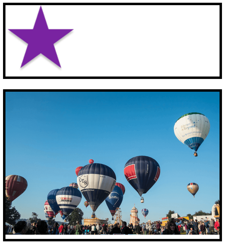
In this task, you have two images in boxes. One image is smaller than the box, the other is larger and breaking out of the box. If you imagine that the box is responsive and therefore could grow and shrink, which property would you apply to the image so that the large image shrinks down into the box but the small image does not stretch.
Copy and paste the code below in a file named max-width.html.
<!DOCTYPE html>
<html lang="en">
  <head>
    <meta charset="utf-8" />
    <title>Sizing Task 3: maximum width and images</title>
    <style>
    body {
      background-color: #fff;
      color: #333;
      font: 1.2em / 1.5 Helvetica Neue, Helvetica, Arial, sans-serif;
      padding: 1em;
      margin: 0;
    }

    .box {
      border: 5px solid #000;
      width: 400px;
      margin-bottom: 1em;
    }

    img {

    }

    </style>
  </head>

  <body>

    <div class="box">
      <img src="star.png" alt="star">
    </div>

    <div class="box">
      <img src="balloons.jpg" alt="balloons">
    </div>

  </body>
</html>
Your final result should look like the images below:
When you’re ready, move the files in the following path user/week03/exercises/day05/sizing_tasks/task03/ and run the git commands below to submit your exercise:
git add user/week03/exercises/day05/sizing_tasks/task03/git commit -m "sizing_tasks_task03"git push
Sources and Attributions
Content is based on the following sources: