31.4. Dynamic Style Changes
By adding event listeners to our Angular projects, we can make any element on our web page interactive. This allows us to change the styling on the page in response to user actions.
Before we add functionality to the buttons, let's first update our text styling a little bit.
31.4.1. Interactive Elements
Let's make the paragraph element respond to user clicks.
Change line 12 in skill-set.component.html by adding a (click) event:
1 2 3 4 5 6 7 8 9 10 11 12 13 | <div class="skills">
<h3>{{listHeading}}</h3>
<ol [style.color]="alternateColor" [type]="bulletType">
<li *ngFor="let skill of skills">{{skill}}</li>
</ol>
<hr>
<h3>Copy of Skill List</h3>
<ol [class.ol-style]="changeColor">
<li *ngFor="let skill of skills">{{skill}}</li>
</ol>
<hr>
<p [class.p-style]="!changeColor" (click)="changeColor = !changeColor">Here is some practice text...</p>
</div>
|
Since changeColor is a boolean, (click)="changeColor = !changeColor"
flips the value of the variable between true and false whenever the
text is clicked.
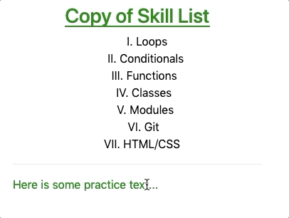
Notice that since the style of the ordered list also depends on
changeColor, its appearance changes as well.
Try It
Replace
(click)with(mouseover)in line 12 and examine how the interactivity changes.What happens if we add
(click)="changeColor = !changeColor"to the<li>tag in line 9? Does this make a single list element clickable or all of them?
31.4.2. Button Styling
The button tag accepts class and style just like other HTML
elements, but button also has its own set of special attributes. Detailed
descriptions of these attributes appear at
W3 schools and
MDN.
However, for these examples we will focus on disabled.
Adding the disabled attribute inside the tag deactivates the button. Any
time you see a greyed out button on a web page, disabled is the cause.
Example
Code:
1 2 | <button [style.background]="lcLightBlue">Click Me!</button>
<button disabled>Can't Click Me!</button>
|
Result:
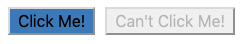
The disabled attribute overrides any other function calls or events within
the button tag.
31.4.2.1. Dynamic Button Activation
Data-binding lets us activate or deactivate buttons based on user actions or variables we control.
Open the buttons.component.html and buttons.component.ts files and
examine the code.
Examples
HTML file:
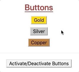
1 2 3 4 5 6 7 | <div class="buttons">
<h3>{{buttonHeading}}</h3>
<button class="gold">Gold</button> <br>
<button class="silver">Silver</button> <br>
<button class="copper">Copper</button> <hr>
<button>Activate/Deactivate Buttons</button>
</div>
|
ButtonsComponent class in the .ts file:
1 2 3 4 5 6 7 8 9 | export class ButtonsComponent implements OnInit {
buttonHeading: string = "Buttons"
inactive: boolean = false;
constructor() { }
ngOnInit() { }
}
|
To dynamically activate or deactivate a button, we need to bind the attribute
to a boolean. In this case, we can use the inactive variable defined in the
buttons.component.ts file.
Modify line 3 in the HTML file as follows:
<button [class.gold]="!inactive" [disabled]="inactive" (click)="inactive = true">Gold</button> <br>
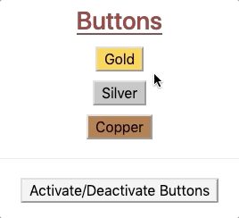
Save your changes and refresh the web page. Now when you click on the "Gold" button,
inactivegets set totrue. This adds thedisabledattribute to the HTML tag, turning it off. In addition, thegoldclass is removed, changing the color of the button.Since the "Gold" button is no longer active, clicking on it again will not trigger any events. To re-enable the button, we need to tie
inactiveto another tag and event.Modify line 6 in the HTML file as follows:
<button (click)="inactive = !inactive">Activate/Deactivate Buttons</button>
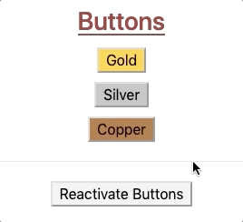
The buttons on the page should now behave something like:
31.4.2.1.1. Silver and Copper
Modify the button tags for "Silver" and "Copper" so that they also depend
on inactive. Properly done, clicking ANY of the buttons deactivates ALL of
them:
If we want to disable only the button that gets clicked, then we will need
to create a separate boolean variable for each element. We must also update the
"Activate/Deactivate" button to reset all of the booleans to true. (Hint:
How about setting the (click) event to a function call?)
31.4.3. Try It!
Modify the code in buttons.component.html and buttons.component.ts to
make the buttons behave like this:
Note
If you find yourself stuck after trying, and trying, and TRYING, remember that
there is a solutions branch in the repository.
31.4.4. Bonus Try It!
Just for fun, use what you have learned about events and data binding to create buttons that behave like this:
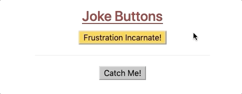
Warning
These bonus options are ONLY FOR FUN. Using any of these on a business website would be a poor choice.
31.4.5. Check Your Understanding
Question
To include dynamic styles in a component:
Only data-binding is needed,
Only an event handler is needed,
Data-binding and event handling are both necessary,
Angular, data-binding, and event handling are all necessary.
Question
Which of the following shows the three Angular directives arranged from the most general to most specific?
Components, structural directives, attribute directives
Components, attribute directives, structural directives
Structural directives, components, attribute directives
Structural directives, attribute directives, components
Attribute directives, structural directives, components
Attribute directives, components, structural directives
Question
Consider the following code samples:
CSS:
.special {
   background-color: blue;
}
TypeScript:
1 2 3 4 5 6 7 8 9 | export class Component implements OnInit {
specialFactor: boolean = false;
constructor() { }
ngOnInit() { }
}
|
HTML:
1 | <div [class.special]="specialFactor">Very Special Content</div>
|
Which of the following, when added to the HTML tag, will render the
<div> element blue when clicked?
(click)="!specialFactor"(click)="specialFactor = 5 < 3"(click)="specialFactor = !specialFactor"(click)="specialFactor = false"